CAP Data Dashboards 2022-2023
See live Website

Data Engineer & Design
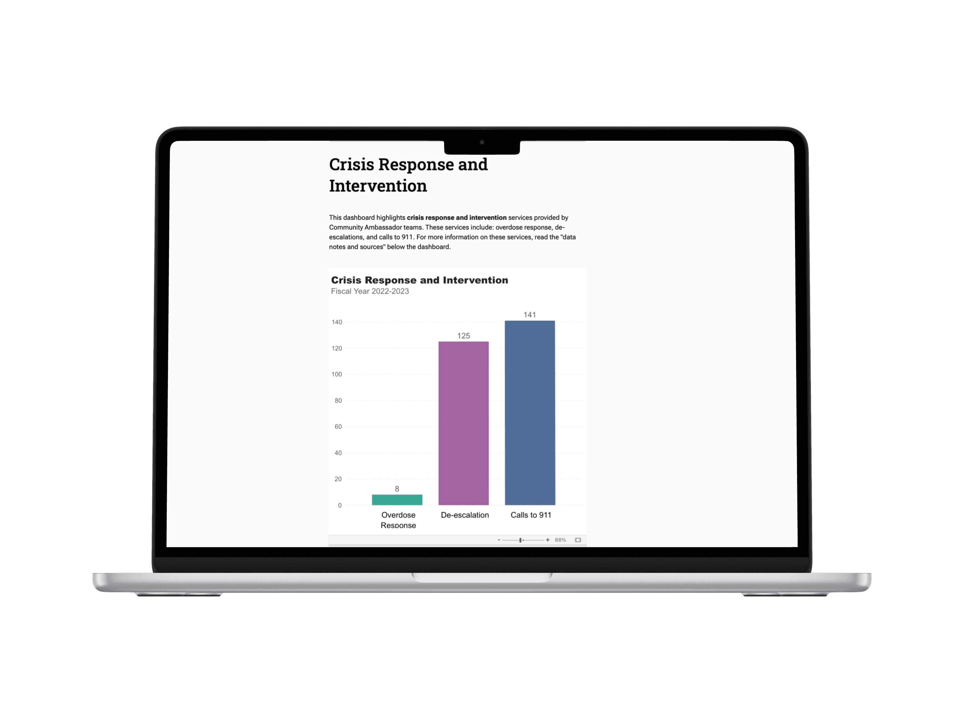
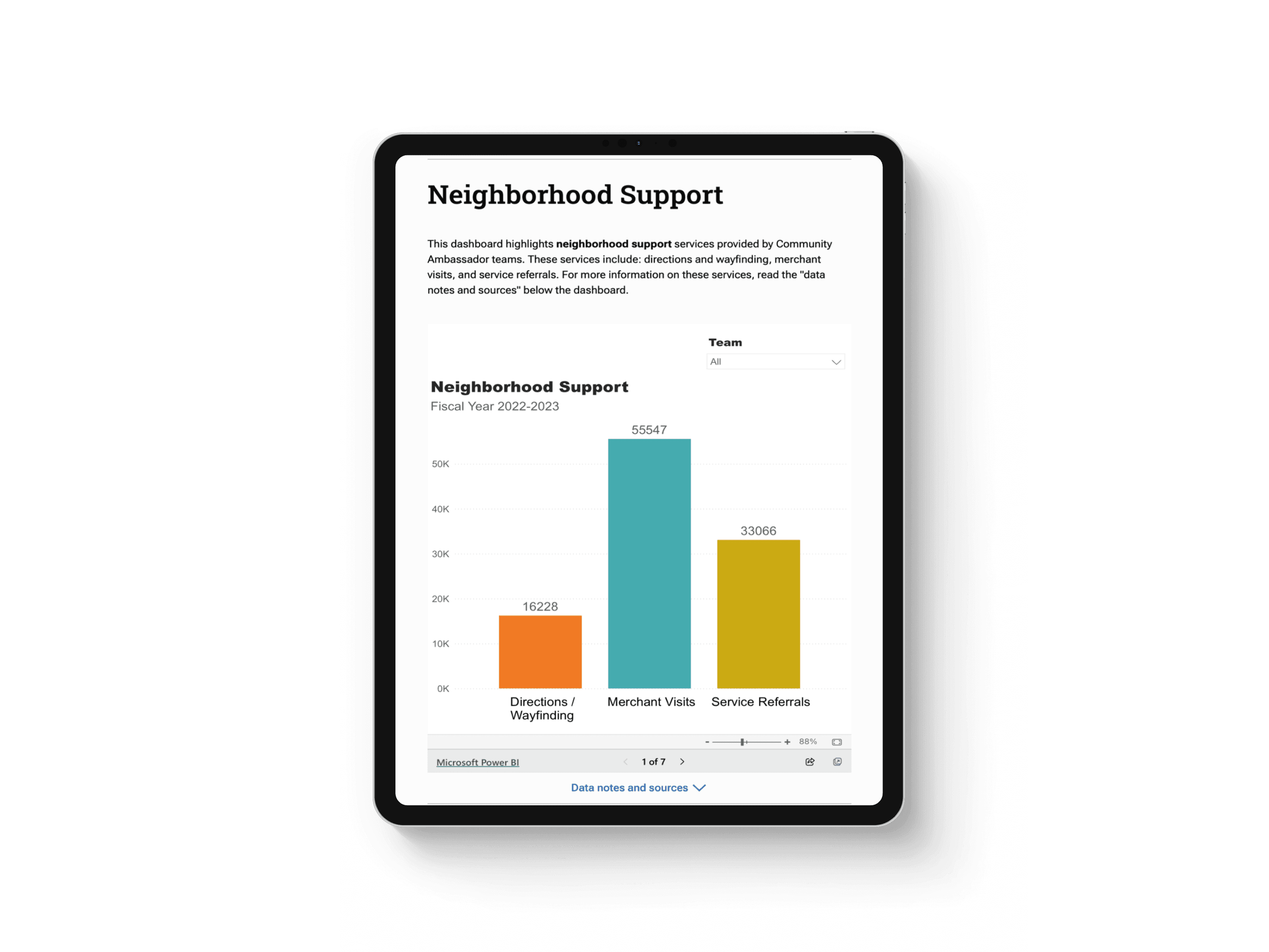
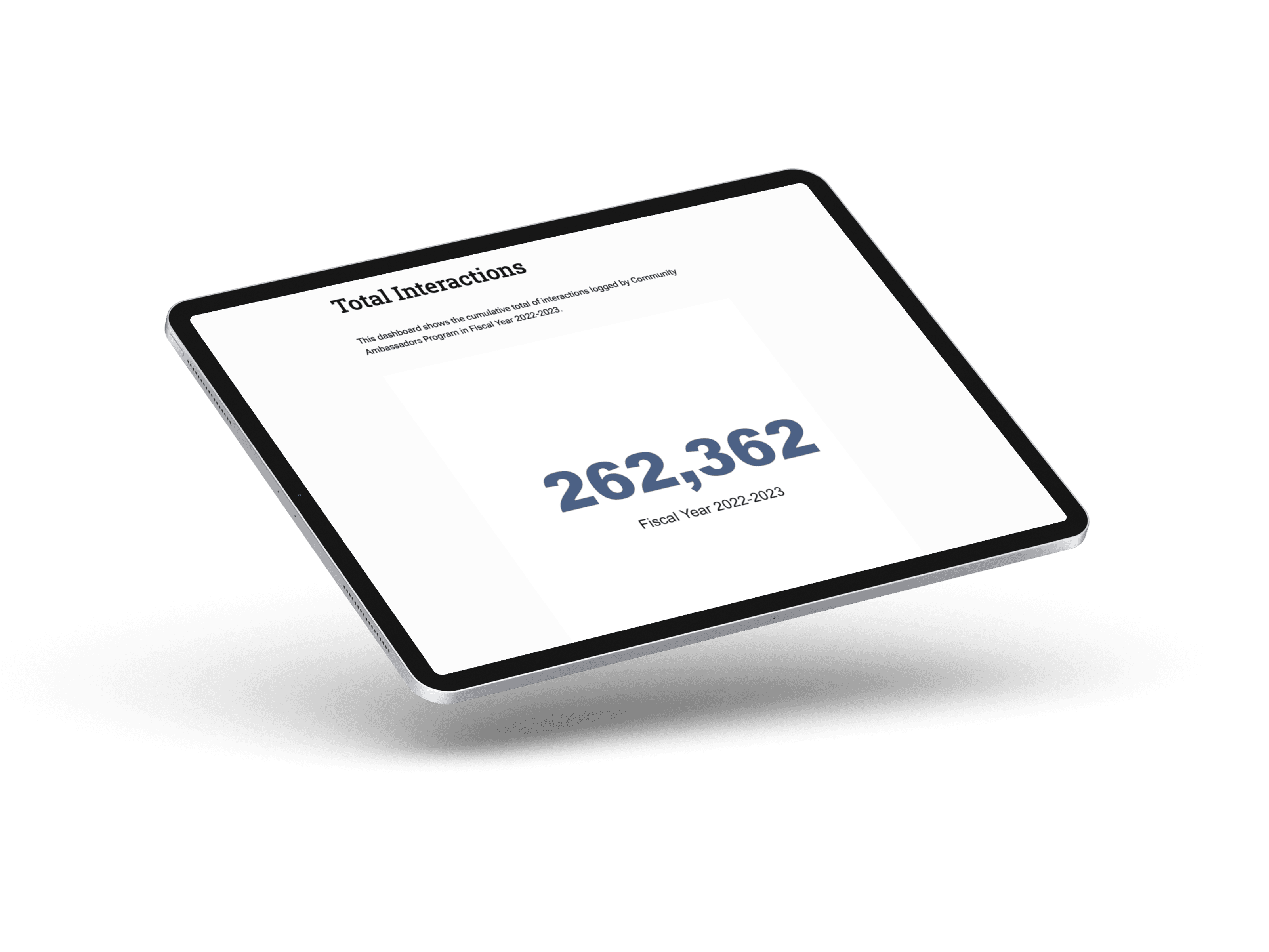
THE PROBLEM The San Francisco Office of Civic Engagement and Immigration Affairs (OCEIA) had a large dataset on the services provided by the Community Ambassadors Program (CAP). However, the multi-dimensional data lacked a clear and effective visualization method, making it difficult to identify trends. This complexity hindered the evaluation of the program's effectiveness and informed strategic decision-making. THE SOLUTION As a data engineer, I led the development of data dashboards that visualize over 260,000 services provided by CAP from 2022 to 2023, transforming complex datasets into actionable insights. I designed and developed more than 20 interactive dashboards and graphs using Power BI, Excel, and SQL. This ensured accuracy and supported data-driven strategies, helping stakeholders evaluate program effectiveness and make informed decisions.